WAR - Chathura Asanka Assessment 2 (24053606 )
The scene has been formed based on a WAR theme. It showcases different types of items related to the WAR field. The scenes are consisted of sounds and tooltip text effects to give good feedback to the user and maintain the best user experience while interacting with the showcase scene's features.
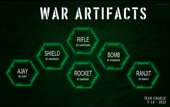
The menu is created to align to the modern WAR concept and choose large icons that can be easily selected even from a small screen. This will give my game a modern look and the colour theme is also used to maintain the modern effects of the menu.
Since I’m madly in love with snippers I choose to model up a sniper rifle. Since sniper rife is a little bit lengthy item, I used my action icons without any descriptions, to use the screen as much as possible. But to avoid the complexity of the action buttons for the user, I used recognizable symbols to avoid being lost once the user looks into them. Also, I will use tooltips to identify the action to understand what it does, where any user who is not familiar with symbols.
In this scene, I arranged the action buttons in a specific recognizable pattern where it makes much easier to understand for the end-user or player. I used the TV remote controller design to place the action buttons where main features and sub-features are separated and easy to identify. It is also placed in the right corner of the screen where it can be accessed easily from the thumb on a mobile device or for lesser mouse movement on a computer.
| Status | In development |
| Platforms | HTML5 |
| Author | ChathurAsanka |
| Genre | Educational |
| Made with | Unity |
| Tags | War |

Comments
Log in with itch.io to leave a comment.
Very good use of UX principles. Overall, the application has a user-centred design. The menu is visually attractive, with good use of consistent hexagonal shapes. The font matches the theme "War" and gives a Call of Duty kind of vibe.
Cognitive friction has been reduced in an effective way, I didn't need to think about what to do or how to navigate. The project followed design consistency and convention.
It's really nice Chathura. The colours and the menu scene are perfectly matching. The object that you have created is good and you have used all the unity tools well. And the sound also matching to this whole project. Wishing you success in your next step.
Hi Chathura, I was impressed by looking at this OMG its grate. When it’s come to war theme you have used perfect background colures, Buttons, sounds and all . You have used all the unity tools perfectly to create this object. Wish you all the best for you next step.